TGI Fridays
Americana restaurant reported problems with page conversions and bookings.
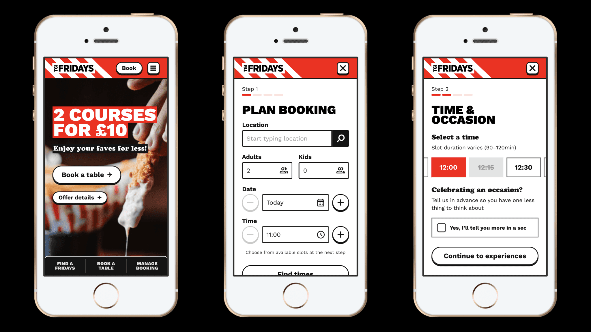
Qualitative research and design of mobile-first booking flow.
Interviews to understand attitudes and behaviours.
Leveraged stakeholder expertise to ideate concepts.
Increased booking completions from 30% to 70%.
Defined A/B tests to improve marketing conversion.
Client
TGI Fridays
Competencies
Attitudinal research Ideation Prototyping Usability Testing Conversion Rate Optimisation
Industry
Hospitality
Duration
8 weeks
Context
TGI Fridays is an Americana-themed restaurant chain. Historically known for post-work cocktails the business had recently rebranded to attract casual diners and families.
The internal marketing team managed content, promotions and individual franchise pages using a CMS. The website was maintained by a technical agency. Booking was enabled by two 3rd party providers.
The challenge
The client reported that key landing pages failed to convert and a high volume of customers were not completing their bookings.
Analytics and feedback suggested a number of reasons:
Big parties had difficulty booking online.
Visibility of available booking slots was poor.
Promotional messaging was confusing.
Objectives
Investigate attitudes and behaviours of typical customers.
Identify pain points in the as-is solution.
Ideate and test concepts to increase completions.
Coordinate with rebrand and new design system.
Constraints
The scope and timeline were limited by the client's need to change technical agencies and re-platform before a contract deadline.
Requirements and flexibility in the booking flow were limited by the functionality of the 3rd party booking engine.
Implementation of the new design system and the build itself would be handed off to the client’s technical agency.
Users
Mobiles users booking with moderate frequency were identified as most relevant and likely to provide comparative insight.
We recruited 6 diverse adults (plus a spare) and an additional two with access needs, to ensure design was informed by data from a relevant and representative pool of users.
My role
I joined the project as Senior Designer after an initial strategy discovery phase, and lead day-to-day activities with a junior colleague and oversight from UX Director.
The Client Success Manager and Project Manager helped coordinate the engagement and involvement of key stakeholders across Friday’s digital marketing team.
Approach & research activities
User research
Ideation & prototyping
Usability testing
Playback

Analysis generated the insights needed to define problems and drive ideation
Attitudes, behaviours and response to the as-is website
Objectives for remote moderated interviews were structured into formative and evaluative phases:
Interview to understand habits and past booking experiences
Contextual enquiry to assess response to key pages and journeys
Closing interview to summarise and verify responses
Figjam's 'Paste to stickies' plugin helped to transfer spreadsheet notes to enable and manage a more visual form of analysis.
The mobile website and booking flow compared poorly with expectations and experience of competitors.
Visual presentation, confusing promotions, product availability and restaurant information were common factors.
Participants regularly use their mobiles to book for convenience and felt group booking was more complicated than expected, with several points of friction adding to the confusion and perception of effort.
12 research questions yielded 41 design recommendations.


Insights helped define design challenges and popular concepts taken forward
Co-design accelerated problem solving
Given the time and technical constraints we needed to maximise stakeholder expertise and ensure buy-in to the design of key moments in the journey. Splitting the ideation into two chunks enabled us to move forward with confidence.
A cross-functional crazy 8s workshop enabled us collectively to explore divergent solutions, and align on 16 concepts to drive design.
Working with my partner and the project Lead I used the same method to ideate on the remaining problems and redefine the booking flow.

Drafting objectives next to screens helped to plan and prep efficiently for UT
Regular check-ins to iterate on a prototype
Scheduling frequent stakeholder check-ins enabled us to iterate on designs at pace.
Using mid-fidelity components based on the evolving design system I prototyped new features, scrolling frames and modals.
Increasing the fidelity was a matter of 'past and replace', to ensure usability was evaluated using the most realistic stimulus possible.
Plotting screens in Figjam was an easy way to document the research objectives for each step and begin drafting tasks for usability testing.
Learning by doing; creating and linking screens for the prototype
UT revealed three themes for further refinement
As ever, making time to run a pilot session highlighted opportunities to improve design and facilitation of tasks for usability testing
We found that participants moved through the flow at pace and didn't always retain informational context from one screen to the next. We revised microcopy, tool tips and button labels to reduce uncertainty and increase users’ confidence to progress.
Use of red and black limited ability to indicate pre-selections and CTAs which caused participants to fail tasks. Complimentary colours were added and variants revised to improve the visibility of active states, information and required actions.
As expected the inclusion of add-ons and promotions within the booking flow distracted users and caused confusion. We revised the treatment and repositioned these elements to minimise impact on the core booking objective
Project outcomes
Design changes informed by research combined to drive an increase in booking completion from 30% to 70%.
Success and additional recommendations helped secured a second phase of work, to minimise cancellations and no-shows, and further increase conversion from bookings.
A retainer was agreed to help pursue strategic objectives and investigate further opportunities to optimise conversion.
Learnings and takeaways
Anticipate challenges with participants’ devices
For the remote contextual enquiry we needed participants to share the screen of their mobile device through Zoom. Despite making recruiters and participants aware of this in advance we lost valuable interview time due to skills and settings for non-iOS devices. In future I'll look to test with multiple devices at the pilot stage.
Economising to run a valuable usability test
Where a product has a broad user base there's an opportunity to test designs quickly and cheaply. Working within a cluster of agencies meant we were able to save time and budget, and add value, by recruiting internally for UT
Note taking methods
During a previous project I’d found that note taking on a whiteboard made it easier to transition into analysis. It worked here too but it was a struggle to keep pace with participants during the test. On reflection I realised that the previous product was far less responsive. In future I need to consider the pace of activity when setting up research.